🌊
2024.09.23 - 2024.10.25
Qistina Nuralya Maria Binti Azly / 0354180
Advanced Typography / Bachelors of Design (Honours) in Creative Media / Taylor's University
Task 1: Exercises
Table of contents
3. PROCESS WORK FOR TYPOGRAPHIC SYSTEMS
4. PROCESS WORK FOR TYPE & PLAY
1. LECTURES
Lecture 1: Typographic Systems
There are 8 major variations within typographic systems:
- Axial
- Radial
- Dilatational
- Random
- Grid
- Modular
- Transitional
- Bilateral
Communication is key in typographical organisation; hierarchy, order of reading, legibility and contrast is important. Typographic systems, in a way, are similar to the term "shape grammars".
Shape Grammars refer to a set of shape rules that can be applied step-by-step to create a set or language of designs.
These systems may be seen as "constricting"; however, it also undeniably provides a solid base/framework of understanding to help guide learners through their exploration whilst also help in the development of their own intuition.
Axial : elements organised to the left or right of an axis or multiple axes.
Radial : elements organised to a point of focus or multiple points.
Dilatational : elements organised in a circular manner.
Random : elements appearing to have no specific pattern or organisation.
Grid : elements organised to vertical and/or horizontal divisions.
Transitional : an informal system of layered banding.
Modular : a series of non-objective elements constructed in standardised units.
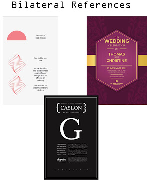
Bilateral : Arranged symmetrically on a single axis (like an invitation card).
Conclusion
The "basic" grid-system is a go-to for many beginner designers, despite the unrealised potential of the other systems. Learning all the other systems can help a designer break free of the rigid horizontal and vertical bars of the grid system. This can further lead to more fluid approaches to typographic designs/messages.
Learning these systems may feel awkward initially, but once you get a full understanding of the systems, you'd be able to realise its creative potential.
Quote of the Lecture: "Typography is the use of type to advocate, educate, elaborate, illuminate and disseminate. Along the way, the words and pages become art." - James Felici, The Complete Manual of Typography.
Lecture 2: Typographic Composition
Typography can be split into two aspects; the creation of letters and the arrangement of large amount of text within a given space. In the terms typographic composition, it talks about the latter.
Principles of Design Composition
Normally when we think of composing elements, we think of ways to create certain elements dominant using pre-existing design principles like emphasis, contrast, asymmetry etc. to create visually appealing designs. However, some of these elements are more suited towards imagery than actual textual information. So, applying said principles on long text can be slightly challenging, but not impossible.
An example of well-translated principle onto a textual layout:
Rule of Thirds
A composition guideline that helps to frame an element and create dynamism. As the name states, a composition can be evenly broken down into thirds, horizontally and vertically; with the intersecting points becoming points of interest. This rule is not commonly used if there are better options for more appealing compositions.
Typographic Systems
Of the 8 known systems of typography, the one that is often used is the Grid system; deriving from the grid compositional layout of the Letter Press printing. which then was enhanced by the Swiss (Modernist) style of typography.
During the more rigid and "ordered" modernist era of typography, a group of young designers decided to challenge this style to opt for more chaotic, random and asymmetrical, inspired by the Punk movement of their time. Despite the chaos though, there was still a sense of order within them, showcasing how typographic layouts can still be exciting and break outside the rigid structure but still maintain a sense or order.
Other Models / Systems
Environmental Grid: based on an extraction made by a designer of an already existing
environment. After the extraction, textual information is placed onto the
key features of said extraction of the environment. Can sometimes include
both curved and straight lines.
Form and Movement: further exploration of the Grid system, allowing students to discover the different ways of applying the grid system in "less serious" or static ways. The placement of text or form over a number of pages contribute to the movement of the text.
Quote of the Lecture: "There is a fine line between genius and insanity, just as there is a fine line between legibility, readability and memorability." - 1st point by Oscar from Levant, 2nd from Mr. Vinod. ( ◡̀_◡́)ᕤ
Lecture 3: Context & Creativity
Handwriting
Studying handwriting is important because the first mechanically produced letterforms were designed to directly imitate handwriting. It becomes the foundation for form, spacing and conventions that mechanical type would try and mimic.
The drawn letterforms were often influenced by materials and tools such as:
- Sharpened bones
- Charcoal sticks
- Plant stems
- Brushes
- Feather
- Steel pens
Additionally, the material in which the letterforms were written on were also a factor;
- Clay
- Papyrus
- Palm Leaf
- Animal Skins
- Paper
Going Further Back into the Past...
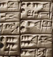
Cuneiform c. 3000 B.C.E: the earliest system of actual writing; was made by using blunt ends of reed stylus on wet clay; evolved from pictograms; read from left to right.
Hieroglyphic images can be utilized in three distinct ways:
- Ideograms - Depict the actual objects they represent.
- Determinatives - Indicate that the preceding signs are phonograms and convey the general concept of the words.
- Phonograms - Represent sounds that form individual words.
Early Greek (5th C. B.C.E.) - Letters were drawn freehand without compasses and rules and lacked serifs. Over time, these letters developed thicker strokes, smaller apertures, and serifs.
Roman Uncials - By the 4th century, Roman letters became more rounded, allowing for fewer strokes and faster writing.
English Half Uncials (8th C.) - In England, uncials evolved into a more slanted and condensed form.
Carolingian Minuscule - Featured capitals at the start of sentences, spaces between words, and punctuation. This style influenced the Humanistic writing of the 15th century, which became the basis for modern lower-case Roman type.
Black Letter (12th-15th C. CE) - Characterized by tight spacing and condensed lettering with evenly spaced verticals, reducing the amount of costly materials needed for book production.
The Italian Renaissance - Rediscovered letterforms called Antica. The Renaissance focus on form in art and architecture extended to letterforms, resulting in more rounded and rationalised letterforms.
Evolution of Middle Eastern Alphabets: The use of letters to represent sounds, likely influenced by Egyptian hieroglyphics and hieratic scripts.
Evolution of the Chinese Script: Progressed from oracle bone script to seal script, then to clerical script, and eventually to traditional and simplified scripts.
Quote of the Lecture: "Looking behind gives you context, looking forward gives you oppurtunities." - Mr. Vinod J. Nair himself ( ◡̀_◡́)ᕤ
Lecture 4: Designing Type
Design type requires 5 important steps:
- Research - to understand the context and purpose of the type-to-be by finding inspiration from existing media or specifically fonts.
- Sketching - putting research into a rough sketch phase to give a look into the different approaches of the type design.
- Digitisation - the process of transferring ideas or sketches onto digital platforms (Illustrator, FontLab etc.).
- Testing - helps refine and correct aspects of the typeface, with prototyping providing crucial feedback; readability and legibility are vital for text typefaces, but for display types, the expression of form is more important.
- Deploy - Sometimes some mistakes can still appear even after deployment so amendments can still be made in this stage.
Type Construction
Constructions grids (with circular forms) can help with the creation of letterforms.
Construction and Considerations
When designing a new typeface, various forms and constructions must be
considered. A key visual adjustment is extending curved and protruding forms
beyond the baseline and cap line (also known as overshoot), which also
applies to the vertical alignment between curved and straight forms.
Fitting Type: Visually adjusting the space between the letterforms so that they appear even.
Quote of the Lecture: "The mindset of a type designer, if clinically studied, might be construed as sick; plagued by an unusual obsession to detail" - Mr. Vinod J. Nair himself ( ◡̀_◡́)ᕤ
Lecture 5: Perception & Organisation
Perception
Perception is the way in which we interpret or regard something.
In typography, perception mainly entails the visual navigation or interpretation of a reader via contrast, form and organisation. It can be used in the context of the use of textual, visual, graphical or the form of color in the content.
Why is it important to have contrast? It's to create clear distinction between information.
Other than Rudi Ruegg, there is Carl Dair who added two more principles; texture and direction.
In total, Dair had 7 kinds of contrast:
- Size : provides a point where the reader's attention is drawn.
Example: Making the heading or title of a text be noticeable bigger than the body text.
- Weight : describes how bold type can stand out in the middle of lighter type of the same style
Example: Using a lightweight typeface for the body text and a bold weight for the headlines.
- Form : the distinction between a capital letter and its lowercase equivalent, or a roman letter and its italic variant, condensed and expanded versions of typeface are also included under the contrast of form.
Example: Creating a typesetting where it combines two different fonts.
- Structure : the different letterforms of different kinds of typefaces.
Example: A monoline sans serif and a traditional serif, or an italic and a blackletter
- Texture : refers to the way the lines of type look as a whole up close and from a distance.
Example: Putting together the contrasts of size, weight, form, and structure, and applying them to a block of text on a page.
- Direction : the opposition between vertical and horizontal, and the angles in between. Turning a single word on its side can create a dramatic layout.
Example: Using an axial layout and having a few words be on the opposite axis.
- Colour : often suggests that a second color is often less emphatic in values than plain black on white. Keep in mind of the importance of tonal values and their emphasis.
Form
Form refers to the overall look and feel of the elements that make up the typographic composition. It is the part that plays a role in visual impact and first impressions.
Typography derives from the Greek words “typos” (form) and “graphis” (writing), which means to write in accordance with form. Typography can be seen as having two functions:
- to represent a concept
- to do so in a visual form
Gestalt is a german word meaning the way a thing has been “placed” or “put together". The Gestalt theory emphasizes that the whole of anything is greater than its parts, this can be the same for designing layouts.
The many Gestalt Laws include:
- Law of Similarity: elements that are similar to each other tend to be perceived as a unified group.
- Law of Proximity: elements that are close together tend to be perceived as a unified group.
- Law of Closure: refers to the mind’s tendency to see complete figures or forms even if a picture is incomplete, partially hidden by other objects, or if part of the information needed to make a complete picture in our minds is missing. Particularly important in creating logotypes.
- Law of Continuation: humans tend to perceive each of two or more objects as different, singular, and uninterrupted object even when they intersect.
- Law of Symmetry: elements that are symmetrical to each other tend to be perceived as a unified group.
- Law of Simplicity (Praganz): when people are presented with complex shapes or a set of ambiguous elements, their brains choose to interpret them in the easiest manner possible.
Quote of the Lecture: "The organization of information and how it is perceived should be considered by designers as a social responsibility — crucial for effective communication, transfer of knowledge and for under-standing to occur. " - Mr. Vinod J. Nair himself ( ◡̀_◡́)ᕤ
2. INSTRUCTIONS:
Task:
Explore eight visual organization systems—Axial, Radial, Dilatational, Random, Grid, Modular, Transitional, and Bilateral. This involves designing using content related to specific design movements or lectures, focusing on flexibility in typographic arrangement. This task must be completed in Adobe InDesign using a 200x200 mm canvas, limited to black and one additional color, and minimal graphical elements.
Axial
Radial
Dilatational
Random
Grid
Modular
Transitional
Bilateral
3.2 Ideation
Axial
Attempt #1 (Left) : I tried going for a "stabbed" or literal "ripped" feel to the layout. In concept it sounded cool but I think my execution of it could be better.
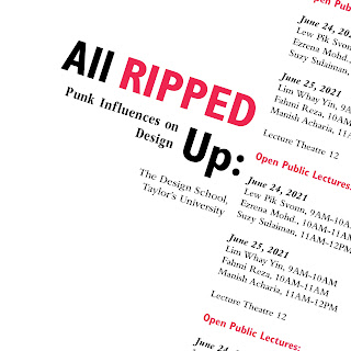
Attempt #2 (Right) : This one followed a simpler format. All of the text followed a single axis line but I liked how the repetition of text and its slanted-ness gave slight movement or interest to the text. And also the fact that it isn't quite centered to the box adds to the "ripped" or more so disconnected feeling. Additionally, I wanted to make it so though the text repeats, the text meant to be read is fully displayed and readable.
So, I decided to further tweak Attempt #2.
There wasn't much that I tweaked on the attempt but I did try out changing the boldness of "Open Public Lectures" and the sizes of the dates. These were to help clearly differentiate the sections of text since the repetition could possibly confuse someone if all of it were t be the same size/thickness.
Font(s) Used:
- Gill Sans Std
- ITC Garamond Std
- Bembo Std
Radial
For my first attempt, I went for a basic layout, having circles as the centre of each of the radial parts. This was mostly to test the waters a bit since personally, this is quite a stiff composition so I went ahead and explored a bit more:
I made this composition a bit more "dynamic", changing the sizes of radial parts, with each part getting smaller to create visual hierarchy. And I also made it so that
Font(s) Used:
- ITC Garamond Std
- Serifa Std
Dilatational
Attempt #1 (Left) : First time ever trying out the "text-in-circle" tool, I made a basic composition that isn't really representative of the text but again, it was just a testing stage.
Attempt #2 (Right) : This composition was inspired by soundwaves since Punk does have a popular subsection under the music industry so I wanted to try pay homage to that. The further away the text is from the circle, the more bigger the text size is to create hierarchy.
Font(s) Used:
- Gill Sans Std
Random
I was pleasantly surprised with how good my first attempt at the Random system was. Having the text rest on the bottom definitely helped with creating the packed chaos. The jagged edges at the top also help with the "Ripped" theme.
Font(s) Used:
- ITC Garamond Std
- Bodoni Std
- Bembo Std
- Futura Std
- Univers LT Std
Grid
Attempt #1 (Left) : I tried creating emphasis on the 'P' in Punk but looking at it right now, it looks to be a bit too heavy against the lighter weight of the rest of the text. Plus I wasn't really satisfied with the overall composition so I went back to the drawing board.
Attempt #2 (Right) : Inspired by the my initial modular system (I did it before Grid), I took the PUNK style heading and put it into this layout. Utilising lines, I sectioned off the different sections of the text (dates, heading etc.) and made the two lines connected to the PUNK heading be "dripping" or just flowing through to the bottom of the page.
Font(s) Used:
- Bodoni Std
- ITC Garamond Std
- Gill Sans Std
- Adobe Caslon Pro (only on attempt #1)
Modular
Attempt #1 (Left) : This attempt is straightforward; I section off the main heading and subheading from the rest of the text, adding red colours to the words I wanted to accentuate. This layout consists of 5 columns and 4 rows, with a margin of 10 mm all around and a gutter of 12mm.
Attempt #2 (Right) : For this one I wanted to go off a bit from the first attempt. This time layout appears split from the middle. The things I liked most from this attempt was the bold PUNK title and the shorter lines between the sections. This layout consists of 4 columns, 4 rows, with a margin of 10 mm all around and a gutter of 4mm.
I decided to combine both of my attempts into one whereby I kept the PUNK style heading and made it look like it was breaking through the straight line of the first attempt (unsubtly representing punk culture (⌐■_■)). Other than that, I added small lines next to the dates to sort of "support" the text since initially it stood by itself in the top right corner.
Font(s) Used:
- ITC Garamond Std
- Bodoni Std
- Gill Sans Std
Transitional
Attempt #1 (Left) : I wanted to try a wavy and pointed composition for my first attempt but I unintentionally made it look like an elephant trunk haha ദ്ദി ༎ຶ‿༎ຶ ). Overall I liked the simplicity of it but it didn't really portray much of the elements of Punk that I wanted it to.
Attempt #2 (Right) : This one has slightly more movement for each of the lines. For the Heading, I tried making it a bit interesting by using the available Type on Path options and chose the 3D ribbon. then I overlapped the original heading with "PUNK INFLUENCES" sort of giving the vibe the words are "breaking through" the original heading. And the whole layout actually looks like fabric being ripped apart.
Font(s) Used:
- ITC Garamond Std
- Futura Std
- Bodoni Std
- Serifa Std
Attempt #1 (Left) : I tried replicating the format I'd see on invitation cards, especially with the dates. This layout is straightforward, with everything being centered.
Attempt #2 (Right) : This one, I took inspiration from one of my references where the body text was laid out in a matter like mine with the title being centered in the top middle. I decided to split the title because it was slightly awkward in the previous attempt so I improved on that. Again, most of the text are centered to the page.
Font(s) Used:
- ITC Garamond Std
- Gill Sans Std
- Bembo Std
- Bodoni Std
- Univers LT Std
After Feedback:
Grid
Mr. Vinod commented that my initial Grid system was acceptable but the "The Design School, Taylor's University" at the top created too much tension. So, I reworked it and moved it under the "All Ripped Up:" heading. I also enlarged the PUNK test and rearranged it to fit into the designated columns. In turn, it separated the words slightly but I personally think it fit the PUNK theme slightly.
Bilateral
After Mr. Vinod's reminder, I realised that my bilateral wasn't a proper one because it wasn't symmetrical so I tried to amend it to make it more symmetrical.
3.3 Final Outcome
Fig 3.3.3 Final Dilatational System [Week 03 - 11/10/2024]
Task:
Students will select an image (of an object or natural element), analyze it for potential letterforms, and transform these forms through an iterative process into refined typographic designs.
4.1 Research
https://pin.it/6eVbPJyIJ
https://pin.it/6KZUgVxNm
https://pin.it/3CFerbuuP
https://pin.it/7HdqLCHW1
4.2 Ideation
~Finding Type Process~
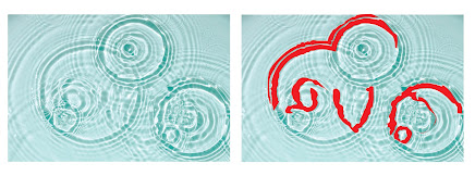
It was a bit tough to trace the letterforms as a lot of the shapes and forms of the ripples themselves are not consistent, as seen in Fig 4.2.2. Alas, I managed to find 5 letterforms from the patterns the water ripples made with those letterforms being M, O, V, E, and Y.
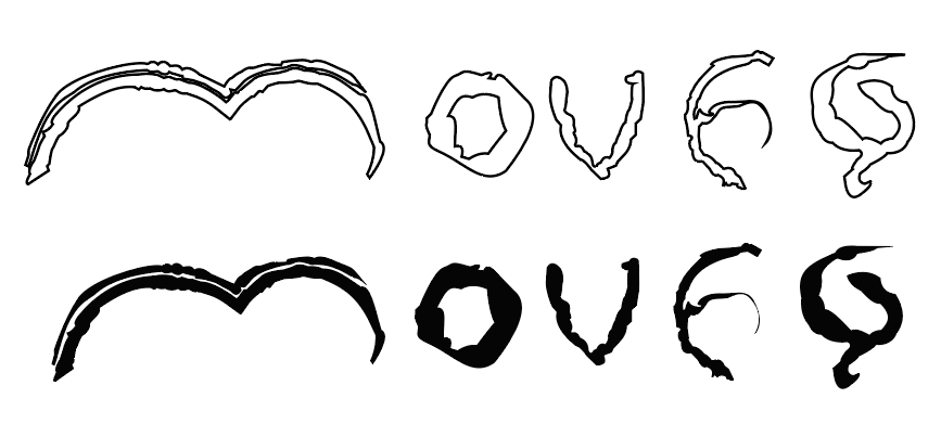
Then, I aligned them all up in a single line. From there, I could get an idea of what my reference font would be so I started to find out any fonts that had less sharp features and more circular elements. I then found Smooth Circulars to which I decided to use as my reference.
I wanted to add ripple characteristics to the letterforms to really give of the ripple vibes. I tested it out on 4/5 of the letters first because I was still figuring out how to shape 'm' at the time.
After slight adjustments and adding a small ripple in 'm', I lined them all together. It still felt a bit off to me so I needed to refine further.
I decided to add more of the ripple effect by "hollowing" out the letterforms. I followed the same pattern the ripples had by making it wavy. It was slightly harder to work on the 'e' but I just figured to hollow out the more thicker parts.
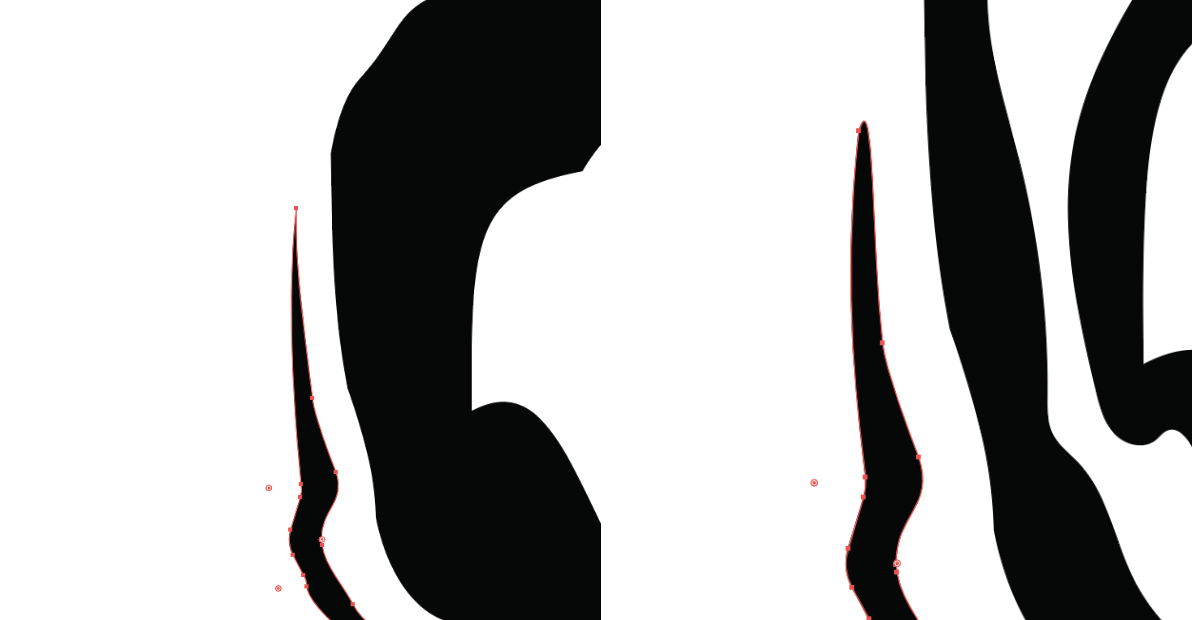
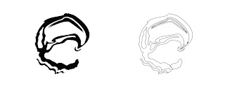
From Fig 4.2.9 though, I started to zoom out and see how the letterforms looked and I realised that the ripples I added initially started to blend in too much to the b=main bodies on=f the letter forms so I adjusted the spacing of them in Fig 4.2.10. I also mirrored the 'y' because it felt better in my eyes.
As I added the final details, I rounded off some of the ripples to better translate when looking from afar.
~Movie Poster Process~
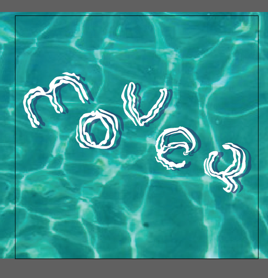
As my letterforms were derived from ripples, I decided to use a water background for my movie poster.
I made a simple floating effect playing with layer settings:
- Shadow : Blue 'Multiply' layer beneath the letterforms, set to 50% opacity.
- Light "Reflection" : Duplicate letterforms and off-set them slightly, set to 50% opacity.
To make the Movie Poster believable, I added text at the bottom showcasing the studios, director, stars etc. Here I just messed around with random names that came into my mind which I had a bit of fun with because they mainly came from my own silly interests. I made sure that the text didn't take too much attention from the main letterforms in the middle fo the poster.
After Feedback:
Mr. Vinod commented that my mock poster seemed unbalanced like the composition was going downwards because of the placement of the 'y'. So I adjusted the placement of 'y' and also in turn the rest of the letterforms to make the composition more balanced.
5. FEEDBACK
Week 1
General Feedback:
- Make sure e-portfolio link leads to LABEL and not
post.
- Take notes in class to better retain
information.
Specific Feedback: N/A
Week 2
General Feedback:
- Make sure colours are not too pastel.
- If your form has no purpose i the artwork, it becomes only decoration.
- If graphics distracts from the content, it's bad design.
- "PUNK" uses eclectic mix of letterforms.
- Creative work is a leap of faith.
Specific Feedback:
- Radial: Good use of graphics to support the design;
- Dilatational: Decent;
- Modular: Evaluate based on previous feedback to other classmates;
- Grid: Acceptable but line at the top of the design creates tension;
- Transitional: Acceptable;
- Bilateral: Is not symmetrical, rework to achieve proper symmetry.
Week 3
General Feedback:
- Try to identify core characteristics in the extracted
letterforms.
- Focus on how the "strokes" appear on the image.
- Choosing textures as your extraction image is not a good
choice.
- understand your image's characteristics; i.e. maintain
sharpness from image to your letterform.
- you're developing observational skills in this exercise.
- initial extraction is fine but you are NOT bound to it.
- Sometimes patterns aren't usually only lines but the shapes
within those lines as well.
- Width consistency is important.
General Feedback:
Specific Feedback:
6. REFLECTION
6.1 Experience
I had a bit of fun when creating my typographic systems since it made my brain cogs work for a bit trying to imagine designs for each category. I mostly disliked doing transitional though since I was confused on how to properly make a good design under that category even after reading articles and watching videos. Which was a bit of a surprise since I thought I'd struggle with Modular system more. Other than the first exercise, I also had a bit of fun extracting and refining the "ripple" letterforms. Though I'm not 100% satisfied with the result, I'm just happy I was able to finish it. Maybe in the future I could revisit the poster and make it even better but for now, it's all I could muster from myself.
6.2 Observations
Everyone in class seemed really above my level, despite myself repeating this module again. I was quite envious of them but I realised my envy was misplaced because to become a designer, I have to learn to be better and not compare my work to others'. Of course, there is a benefit in comparing but constantly comparing and coming to a conclusion that "I'll never be as good" becomes an unhealthy mindset. Putting philosophical things aside though, it was fun to see how everyone worked through the exercises especially with Finding Type and Play. One of my classmates extracted patterns from a giraffe which was very interesting to see ( ദ്ദി ˙ᗜ˙ )
6.3 Findings
I found that I often lag a bit if I didn't find much interest with a task. An example being with the movie poster, I was slightly lagging back a bit but the moment I subtly added my interests in the movie poster (text at the bottom of the poster), I was "replenished" of my energy so I'll most definitely take note of that for my next two tasks! Perhaps I'll have to add more easter eggs of my interests to my tasks or e-portfolio to recapture my attention ദ്ദി ༎ຶ‿༎ຶ )
I was interested in the term "Shape Grammar" Mr. Vinod mentioned during Lecture 1 so I decided to learn more about it through this book!
This book basically goes into the technicalities of Shape Grammars whereby it systematically displays the potential and limitations of creating design. Maroscheck shows how to create unique graphic shapes, challenging traditional notions of creativity and authorship.
Above, Maroscheck experiments in creating a shape using only a 4 squared-area. He makes use of connecting the sharp corners and also adding Bezier curves to the shape to create visual interest. To me, part of the shape does look like a 'G' that is slightly distorted in a unique way.
Additionally, the book has tons of pages where its like a visual library as Maroscheck displays the intricate differences between design changes whether it be miniscule or not. In Fig 7.2, Maroscheck organises the design in a table manner whereby each row contain variations of a single design.
Overall, the book is like an extensive "design dictionary" that a lot of graphic designers or even typographers can gain inspiration from. I definitely recommend this to beginner/intermediate typographers (like me) to just look through this book to get both inspiration and generally get more knowledge on how shapes communicate different things in typography and the importance of having many variations of a single design!
🌊
















Comments
Post a Comment