🐚
Week 6 - Week 8
2023.10.31 - 2023.11.19
Qistina Nuralya Maria Binti Azly / 0354180
Typography / Bachelors of Design (Honours) in Creative Media / Taylor's
University
Task 2: Typographic Exploration & Communication (Text Formatting
and Expression)
Table of contents
3. PROGRESS WORK ON EDITORIAL LAYOUT
1. LECTURES
1.1 Pre-recorded Lectures
All lecture notes have been recorded in Task 1.
1.2 Face-to-Face Classes
Week 6:
Feedback session for our Task 2.
Week 7:
After finalising our Task 2, we got a preview of what our Task 3 would be; analysing letters in different typefaces. Ms. Hsin said that she would give a demonstration of writing the letters on graph paper when we got back from our Individual Learning week. Then, we all agreed on a deadline for our Task 2 E-Portfolio which would be Sunday 19/11/2023.
Week 8:
Individual Learning Week so no classes (੭ ᐛ )
2. INSTRUCTIONS
File 2.1 Module Information Booklet (PDF)
3. PROGRESS WORK FOR EDITORIAL LAYOUT
For our Editorial Layout Task, we were given three different materials to
adapt into an editorial layout. The headlines of which were:
- The role of Bauhaus thought on modern culture
- A code to build on and live by
- Unite to visualise a better world
For Research, I decided to go look into Code and Unite.
3.1 Research
A CODE to build on and live by
UNITE to visualise a better world
Links:
3.2 Ideation
Initial Headline Expressions
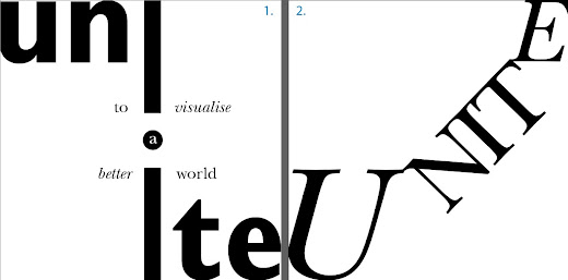
Fig. 3.2.1 'Unite' headline expressions #1 and #2.
Headline Expression #1 (Unite): I actually quite liked the choice
of the bold 'Unite' and using the tittle (dot) of the letter 'i' as the
connecting point for 'un' and 'te'; but, I couldn't really think of a way
to incorporate the rest of the headline into the design so I slightly
winged the rest of the words into the design.
Headline Expression #2 (Unite): I had an idea to make
'Unite' as a sort of bridge but I couldn't really get past the current
design.
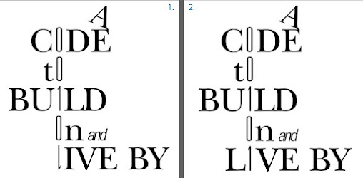
Fig. 3.2.2 'Code' headline expressions #1 and #2.
Headline Expression #1 (Code): I fully went into the binary
definition of code whereby I aligned all the letters that resembled 0s
and 1s from the words into a straight line like a line of binary code.
Then, to add slight differences between the numbers and letters, I
changed the typeface of the letter to a lighter one.
Headline Expression #2 (Code): I reworked the previous design
slightly by changing the "LIVE" placement in the design so that it
wouldn't be as confusing to read as the previous design.
Fig. 3.2.3 'Code' headline expression #3.
Headline Expression #3 (Code): I went for a more HTML definition of
code for this design.
After feedback from Ms. Hsin, I went and reworked my headline expression
#2 (Code) and finalised it.
Fig. 3.2.4 'Code' final headline design.
(I actually finalised the design throughout designing the whole
editorial layout so you will see previous headline designs when I try
out compositions :])
Initially, I actually set my artboard to the incorrect size so please try
and amuse these attempts which turned out to be mistakes ( ; ω ; ).
However, I'll use what I learned from these mistakes for the properly
sized layouts.
Fig. 3.2.5 Editorial Layout #1
Initially, I went for a simple composition for the layout, with only
three columns and the headline would be put at the bottom left of the
text. You can see I didn't use my finalised design but it was because
I reworked it in-between compositions. Aside from that, I separated
the last paragraph of the body text as it differs in terms of format
from the rest of the text.
Fig. 3.2.6 Editorial Layout #2
For #2, I worked from the previous layout and improved parts of it
such as the indents in the paragraphs. I italicised the first
sentences of the paragraphs (except the last) to show that the
sentences have a connection to each other. In other words, I showed
distinction in the topic sentences.
Fig. 3.2.7 Editorial Layout #3
For this layout, I changed the headline design to the one right before
my final design.
Now for the properly sized layout:
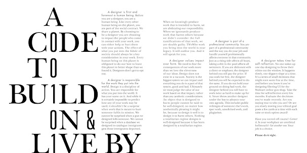
Fig. 3.2.8 Finalised Editorial Layout
- The headline design into the finalised version and increasing the size to give more of an impact;
- The number of columns is now 6;
- The typeface of the topic sentences of the paragraphs;
- Separating the last paragraph into two to give emphasis on "Please do it right."
3.3 Final Outcome
HEAD
Fonts: ITC New Baskerville Std Roman (Letters); Univers LT Std 49 Light Ultra Condensed (Numbers and '&')
Type Sizes: 108pt (Letters); 100pt (Numbers and '&')
Leading: -
Paragraph spacing: -
BODY
Font: ITC New Baskerville Std Roman (Body Text), Italic ("Correct it...Get another one.."), Bold ("Please do it right."); Futura Std Medium ("A designer..")
Type Sizes: 10pt, 9.5pt ("A designer..")
Leading: 12pt
Paragraph spacing: 8mm (First line Left Indent), 4.2mm (Space After)
Characters per-line: 38
Alignment: Left
Margins: 12.7mm top, 12.7mm left, 12.7mm right, 12.7mm bottom
Columns: 6
Gutter: 5 mm
File 3.3.1 Final Editorial Layout - No Guidelines (PDF) [Week 7 -
7/11/2023]
File 3.3.1 Final Editorial Layout - No Guidelines (PDF) [Week 7 -
7/11/2023]
4. FEEDBACK
Week 6
- It's fine to set the title in the centre, but it needs certain guidelines
to help the reader know the reading hierarchy.
- It's important to give rationalisation to a design to give readers an
idea of what you are trying to portray.
- Usually, indents start in the second paragraph.
Specific Feedback:
The title of my e-portfolio used a cursive typeface so Ms. Hsin advised
that I try to keep things as default as I can.
Editorial Layout
- "A" in the heading is too distracting; almost like it's waving 'hey!
look at me!'
- Change 'and' to ampersands (&). - Be mindful of indents.
- Create a balance between the numbers and letters in the heading (aka
thicken the numbers slightly).
General Feedback:
Week 7
- Setting body text in different directions affects reading direction;
advised to not change the reading direction of body text.
- Characters should not exceed 50 per line; eyes become naturally tired
when there is visually more text to read per line.
Specific Feedback:
-The final layout is good.
- The first sentences of each paragraph (A designer...) have the ascender
and descender slightly too close; advised to reduce the typesize of the
sentences by 0.5pts.
As mentioned before in a pre-recorded lecture video, white rivers of text could appear when using justified text. That's why it's so important to know of balancing space between words. However, it's quite surprising that the book (Fig 6.2) was fully published without a proper evaluation of how terribly the text formatting looked.
In general text, line spacing is often uniform and rarely has their ascenders and descenders clash. However, a typographer can utilise the use of line spacing in less linear designs whereby they break the normal line spacing rules in favour of well-maintained chaos.
Week 8
*Individual Learning Week ヽ(*・ω・)ノ*
5. REFLECTION
5.1 Experiences
Coming straight out of Task 1 and into Task 2, I felt like it was quite
a breeze to get through this task because I had proper knowledge of type
expressions as well as making appealing editorial layouts beforehand. I
was also still getting used to using InDesign and had a couple of
moments of confusion as you could see from my editorial layout
progression.
The thing I liked most during this task was the type expression because
like in the previous task, I personally least favoured the "static
placement" of the body text. Not to say I didn't like the process, I
just liked designing type expression most because I feel like I had more
space for creativity there than the text formatting of the layout.
5.2 Observations
During classes, I felt like things definitely went smoother in terms of
our progression because we were prepared for the task. Of course, some
were probably still left behind slightly but I'm merely speaking
generally. Again, it was really nice to see everyone's editorial works
and how they went about their designs with their own research and
interpretations of the headlines. (〃´𓎟`〃)
5.3 Findings
I found that I actually get easily nauseous and can physically feel my
eyes get heavier if I stay too long doing my assignments on my
computer (ᵕ — ᴗ —). Besides that glaring health issue that I should definitely
try to fix, I did find that I'm slightly growing to like text
formatting slightly more than the previous task, even by a
smidge.
Overall, I found this task to be an interesting blend of type
expression and text formatting!
6. FURTHER READING
For these three weeks, I managed to find the time to read only one book
that I borrowed from the Taylor's Library. I used high-quality screenshots
from
an online PDF
of the book but please do trust me when I say that I, in fact, did read
the physical copy (>﹏<)
Thinking with Type
Fig. 6.1 "Thinking with Type: 2nd Edition" by Ellen
Lupton.
Personally, I think this book is a good blend or
straightforwardness and detail. It covers a wide range of
typographic topics like the anatomy of typefaces, mistakes in text,
using grids as frames for text etc. Overall, I think students who
are really interested in typography should have a look into this
book because even I, a person who usually gravitate towards books
that have mostly illustration/graphics, found this book to be a
really interesting read!
Fig. 6.2 "Thinking with Type: 2nd Edition" by Ellen
Lupton; page 90.
As mentioned before in a pre-recorded lecture video, white rivers of text could appear when using justified text. That's why it's so important to know of balancing space between words. However, it's quite surprising that the book (Fig 6.2) was fully published without a proper evaluation of how terribly the text formatting looked.
Fig. 6.3 "Thinking with Type: 2nd Edition" by Ellen
Lupton; page 111.
In general text, line spacing is often uniform and rarely has their ascenders and descenders clash. However, a typographer can utilise the use of line spacing in less linear designs whereby they break the normal line spacing rules in favour of well-maintained chaos.
For example, in Fig. 6.3, you can see in the design at the top of
the page that the use of different typefaces with extremely tight line
spacing and differing sizes creates a dramatic density that bodes well
with the whole vibe of the page/entire book.
Fun fact: Though it may look digitally made, the designs were actually made long
before the innovation of digital typography. The book (where the designs
came from) itself entirely depended on phototypesetting*
as well as dry transfer lettering.
* Phototypesetting refers
to the typesetting technique that creates columns of type on a scroll of
photographic paper by using photography.
~~~
For the next part, I will mostly critique some typography I found out in
the wild during the past three weeks. Though it might
not count as further reading, I still
consider it as further learning on my part since I'm using what
I've learned and applying it to my observations of my surroundings :D
My first critique:
Fig. 6.4 Hidang's questions and reservations screen that
was placed above their cashier counter.
Context: I recently went to a restaurant in KL called "Hidang"
which was situated in a neighbourhood-esque area with my family. At
first glance at the screen, I thought "Woah, so many glaring colours.".
Then, I looked closer and saw the different clashing typefaces they used
in the design.
I think the "Hidang" logo itself isn't bad, I'd say it's quite nice and
simple; it's only the slogan "selera kampung selera kita" that really
clashes with the whole logotype. Comic Sans, in general, isn't deemed
appropriate for logos by professional graphic designers. So using that
knowledge, perhaps a more fitting typeface could be a Sans-serif.
E.g. Josefin Sans, Merriweather Sans.
The same would go for the QR code caption "SILA IMBAS UNTUK PERTANYAAN
& TEMPAHAN". It just needs a matching typeface to really pull the
piece together
However, I will say that the restaurant had a really home-y vibe so I
slightly like the authentic "homemade-ness" that the whole screen
portrays. It feels like a parent hurriedly making a slide for their
kid's school project, and I mean it in a comforting and nostalgic kind
of way ᐠ( ᐛ )ᐟ
My next critique:
Fig. 6.5 "My Love Story with Yamada-kun at Lv999" manga by
Mashiro; ENG (Right) and JP (Left).
Context: "My Love Story with Yamada-kun at Lv999" is a popular romantic
comedy shoujo* manga written and
illustrated by Mashiro. The story follows Akane Kinoshita, a college student. Following
her boyfriend's breakup, she resumes playing the massively multiplayer
online role-playing game Forest of Savior (FoS) and attends an offline
event. There, she meets Akito Yamada, a gorgeous but heartless high
school student.
* Shoujo refers to
the genre of Japanese animated movies and comics that target mostly young
girls and are usually defined by an emphasis on romantic and
interpersonal relationships.
I personally have not read this manga but I came across these covers
while scrolling through Twitter (now called X) and saw that English fans
of the manga critiqued the differences between the English and Japanese
covers, and I... couldn't agree more with their critiques.
First, the Japanese cover has a pixel-like typeface for the 'Lv999'
which goes hand-in-hand with the theme of the story. Additionally, the
bubbly typeface for the Japanese writing helps give the casual and soft
vibe of the manga clearly to the reader.
Onto the English cover, the absence of anything game-related in the
design really pulls it down. The typeface used here is not inherently
offensive, but it doesn't properly convey the theme or vibe of the
manga. Additionally, it covers almost half of the page and I personally
like it when covers have their title not blocking most of the actual
art. Yes, in the Japanese cover, the title also covers parts of the art;
however, the composition of the title is balanced whilst the English
title is just sitting there.
Overall, I think the simple overlook in typography within the English
cover really makes it look like a generic read when in reality,
according to fans, it's a comforting and funny manga. (•ᴗ•)
My last critique:
Fig. 6.6 "Tunnel II" by Dafi Kühne.
Context: Dafi Kühne is a Swiss designer and
letterpress printer. To create cultural posters, he uses an
unconventional combination of analog and digital tools in his studio.
Using letterpress printing presses, he prints all of the posters in his
studio under the one major rule that "no PDF ever leaves the studio as a
final product." His primarily typographic posters have been displayed
globally and have garnered international recognition. This is the second
letterpress in his tunnel series for
tunnel-glarus.ch.
I came across Dafi Kühne through a website that Ms. Hsin herself
recommended us to just browse for inspiration. I really liked the
composition of the poster. The way the bold letters are shaped into the
impression of a tunnel and how the rest of the information follows the
shape and is put in between the letters is really nice. Though it lacks
colour, the boldness of the poster helps with its appeal.
Overall, I only have good things to say about which is a refresher from
the previous critiques. To see more of Dafi Kühne's work,
click here!
🐚


Comments
Post a Comment