🐚
Week 05 - Week 10
2024.10.23 - 2024.11.27
Qistina Nuralya Maria Binti Azly / 0354180
Advanced Typography / Bachelors of Design (Honours) in Creative Media /
Taylor's University
Task 2: Key Artwork and Collateral
Table of contents
1. LECTURES
1.1 Pre-recorded Lectures
2. INSTRUCTIONS
3. PROCESS WORK FOR KEY ARTWORK
3.1 Research
3.2 Ideation
3.3 Final Outcome
4. PROCESS WORK FOR COLLATERAL
4.1 Research
4.2 Ideation
4.3 Final Outcome
6. FEEDBACK
7. REFLECTION
8. FURTHER READING
1. LECTURES
1.1 Pre-recorded Lectures
All lectures notes are in
Task 1's blog post.
File 2.1 Module Information Booklet
3. PROCESS WORK FOR KEY ARTWORK
3.1 Research
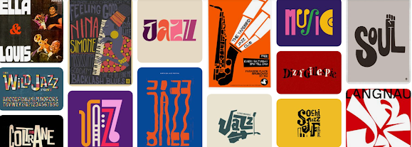
I wanted to explore my keywords abit and so I went and searched
typography I liked on Pinterest and jumbled them together on an
Inspo board.
Fig 3.1.1 Inspoboard
Fig 3.1.2 Initial Sketches
For sketching out the designs, I decided for my final keywords to be
Jazzy, Bold and Easy-going.
3.2 Ideation
Fig 3.2.1 First proper digitisations.
Fig 3.2.2 Choosing one design out of the 4.
Since I now had the idea of what I wanted to sketch plus the moodboard,
I created a number of sketches, mainly focusing on the Bold and Jazzy
side of my keywords (Fig 3.2.1). After making the wordmarks go
through an elimination round, I narrowed it down to 4 possible final
wordmarks. I ended up liking No.4 (at the bottom of Fig 3.2.2)
and going through with working on that one. My thought process behind it
was that it resembled a maze within its negative space and I took a
liking to it.
Fig 3.2.3 Cutting the connection between 'T', 'S' and
'I'
After a bit of feedback from Mr. Vinod, he commented that the 'T' in
the middle of the wordmark that's connected to the 'S' and 'I' was
overcomplicating things. So, he suggested I cut off the connections and
let "T stand on its own.
Fig 3.2.4 Colour Palette exploration.
Fig 3.2.5 Finalising Colour Palette and Wordmark.
Then, I explored a bit with colour combinations that would fit my
liking and ended up with a more purple-centric colour pallete (Fig 3.2.5)
Fig 3.2.6 Animating wordmark in Adobe Animate.
Fig 3.2.6 Rough draft animation.
I animated the wordmark on Adobe Animate. The first draft of the
animation was quite rough since I was still learning how to use the
program.
Fig 3.2.7 Adjusting framerate of animation.
But I figured out that I could remove some frames to give the reveal of
the wordmark more impact. Additionally, I also increased the framerate
to 100 Frames Per Second because of how choppy it looked on the normal
50 FPS.
3.3 Final Outcome
Fig 3.3.1 Black wordmark on white background (JPEG)
Fig 3.3.2 White wordmark on black background (JPEG)
Fig 3.3.3 Colour Palette (JPEG)
Fig 3.3.4 Wordmark with actual chosen colours (JPEG)
Fig 3.3.5 Lightest shade on darkest shaded-background.
(JPEG)
Fig 3.3.6 Final Key Artwork Animation (GIF)
File 3.3.1 Task 2A PDF Compilation (PDF)
^=Back To Top=^
4. PROCESS WORK FOR COLLATERAL
4.1 Research
4.2 Ideation
For all Mock-ups, I acquired them through
Unblast.com.
I decided to rationalise my choices of Notebook, Vinyl and Tote bag as
mock-ups as imagining myself owning a records shop and needing to sell
things other than vinyls to keep the shop open hence the merchandised
notebooks and tote bags to go along with the vinyls.
Collateral #1 - Notebook
Fig 4.2.1 Mock-up notebook base and added design.
The design for the notebook was meant to go for that maze feel I
initially liked about the original wordmark. I did have to adjust the
hues of the background to properly match my colour palette.
Collateral #2 - Vinyl
Fig 4.2.2 Mock-up vinyl base and added design.
Everything done to the vinyl is pretty much similar to what I'd done to
the notebook, the only difference being I had to make two designs to
cover the centre labels. One being only 'WIS' surrounded by lines to
make that maze look and the other being the wordmark repeated to, again,
create that maze feel.
Collateral #3 - Tote bag
Fig 4.2.3 Mock-up tote bag base and added design and
adjustments.
Somewhat similar process as the other two; however, the concept of the
design on this is a bit different. I took the 'T' from the wordmark and
added a "hook" on the left side and repeated the shape into the pattern
above. I also only now realise it reminds me a bit of Taylor's Uni
Logo.
Extras
Fig 4.2.4 Self-Portrait.
I made a simple edit for my self-portrait. I did an outline around
myself to connect it with the wordmarks around me.
Fig 4.2.5 Creating designs for instagram posts.
Fig 4.2.6 Profile Picture Designs.
4.3 Final Outcome
Fig 3.3.1 Final Collateral #1 - Notebook (JPEG)
Fig 3.3.2 Final Collateral #2 - Vinyl (JPEG)
Fig 3.3.3 Final Collateral #3 - Tote Bag (JPEG)
Fig 3.3.4 Instagram Feed Layout (JPEG)
Fig 3.3.5 Screenshot of Instagram page (JPEG)
5. FEEDBACK
Week 5
General Feedback:
- Mindmaps help with giving yourself direction to a design.
- Focus on wordmark solely (digitally).
- Explore further on your ideas & concepts
Specific Feedback:
- Narrow down on your keywords to further explore concepts; right
now my creative directions are going everywhere.
- 'Jazzy' is not only music but also the vibe, attitude and
mannerisms; like being cool, unique etc.
Week 6
General Feedback:
- Make sure your colour pallete has a dark, mid-tone, neutral and
light colour.
- Analyse panagrams, not just look!
Specific Feedback:
- Cut the connection between the S, T and I to reduce
complexity.
- Accent colour is too dull; make it more vibrant.
- Add one neutral shade; light-greyish/off-white/something that
isn't similar to the current colour.
Week 7
General Feedback: N/A
Specific Feedback: N/A
Week 8
- Independent Learning Week -
Week 9
General Feedback:
- Make simple animations or to what level of animation you are
capable of.
Specific Feedback:
- Rework the self-portrait design; create a better
expansion.
- Adjust the colours of the mock-ups.
6. REFLECTION
6.1 Experience
Unfortunately, had a really rough time with this Task as I just
felt like I wasn't as invested in it as I should've been. It's
definitely my own responsibility to consistently track my own
progress and show the best version of my work for this Task but I
didn't really click into it which definitely showed in my
less-than-decent process. I think if I were in the proper mindset
and maybe with a lesser load of other modules to juggle, I might've
been slightly more into creating my key artworks and
collaterals.
6.2 Observations
During class, I saw that I was considerably slower in my progress
compared to my classmates. Everyone seemed to be filled with ideas
whilst I just, at the time, had one or two. They all had interesting
ideas, and I was innately inspired by them. Around Week 5, I realised
the module was more fast-paced and that if you wanted to really excel,
you had to keep up; to which I evidently failed at.
6.3 Findings
I found that to be a good typographer, I have to learn to be my own
critic; to be more critical of my work. And afterwards, I'd have to
be open to criticism and not let it easily get me down.
7. FURTHER READING
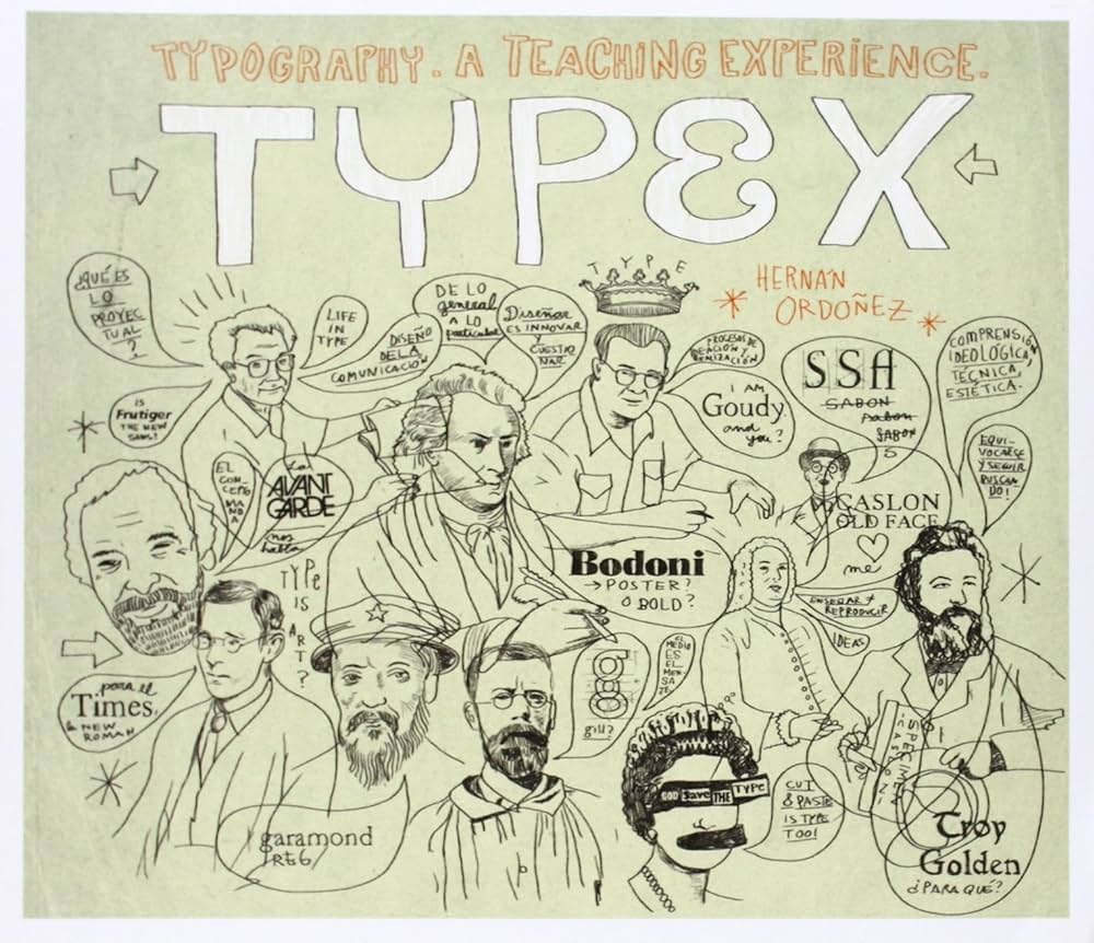
Fig 7.1 Type X by Hernan Ordonez.
Since I was in a bit of a rut, I went to the library to find any
kind of inspiration or ideas to maybe cleanse my mind a bit. I
found "Type X" by Hernan Ordonez and was interested in the cover
art so I went through the book.


.JPG) Fig 7.2 Type X by Hernan Ordonez (pg. 75-77)
Fig 7.2 Type X by Hernan Ordonez (pg. 75-77)
Luckily for me, the book had a short section where Ordonez compiled
different logotypes created by a number of people. It's interesting
to see the arrangements of some of these like that of Sergia
Roberldo Etchepare in page 75. The way he connected the S and R is
unique; however, I will say that at first glance, the combination of
the two letters do appear to look like "JR" rather than "SR". Which
is an important reminder to be mindful of what your logotype looks
like in the case it doesn't appear how you intended it to be.
Overall, I'd say this book is a nice mind cleanser especially if
you're in an artblock and unsure of what to create. In the future,
I'd love to make my own logotypes in my casual, non-pressured time
outside of university since it is something I'm somewhat interested
in, but I haven't gotten into it that much yet.
^=Back To Top=^


.JPG)


Comments
Post a Comment