🌊
2025.06.04 - 2025.06.22
Qistina Nuralya Maria Binti Azly / 0354180
Interactive Design/ Bachelors of Design (Honours) in Creative Media / Taylor's University
PROJECT 2: PROTOTYPE
Table of contents (Quicklinks)
1. MODULE INFORMATION BOOKLET (MIB)
1. MODULE INFORMATION BOOKLET (MIB)
This is the Module Information Booklet for this module:
2. PROCESS
Task: Translate your website redesign proposal into a functional prototype. This prototype should visually and interactively represent the proposed changes, demonstrating your ability to apply design principles and UX strategies effectively.
Building upon your previous assignment (Website Redesign Proposal), you are now required to develop a prototype of the redesigned website. This prototype should reflect the proposed visual design and user experience improvements, providing a tangible representation of the final product.
2.1 Reference
Referring to my slides in Project 1, I used back my mood board's contents to reference for my Prototype Design.


Looking at the reference websites I picked up different elements that made them appealing:
-
Professional Design: clean, modern layout that reflects trust and credibility of the company.
-
Easy Navigation: simple menus for easy access to services, contact, and team info.
-
Strong Homepage: homepage clearly shows what the company does and why they’re good.
-
Client Testimonials: short, authentic quotes by previous clients to give credibility to services.
-
Call-to-Action: clear buttons like “Free Case Analysis” or “Contact Us”.
2.2 Wireframing
For wireframing, I created them in Figma and studied the layout of the previous sites I referenced before and made two different main page layouts, of which I favored the second layout more than the first. To also show a bit more believability of the wireframe, I added three extra pages where the main page would branch to: Testimonials, Session Booking/Contact and Services.

Here are the chosen and fully detailed wireframes:


2.3 Figma
For this part, I sourced pictures from Pexels.com and icons from Figma's Iconify Plugin.
~~~
I started by recreating the navigation bar and applied the fonts and colors from my mood board. Additionally I also added in the Certified Polygraph logo I made in Canva.

Then, I made responsive buttons for the "Free Consultation" button using the component feature in Figma. Next I applied the button into the Hero section as well to grab the user's attention especially with the picture of the "John Grogan" displayed widely on the screen.


I also added interactions for each buttons to make sure they navigate users to certain pages when clicked. For example, I created arrow buttons for the 3 core pages and made sure to add the "Back" button function to it so users are able to backtrack to the page they were previously on.

One part I notably struggled with was creating a drop menu for the navigation bar that I genuinely had to take a break for a while because I noticed how much I started "rage Ctrl C - Ctrl V"-ing my keyboard ಥ‿ಥ


I started adding pictures by masking images into the prototype. I also made changes from the initial Testimonials wireframe and the prototype because I wanted it to look more filled with testimonials and linking the testimonials page directly to the booking page after users scroll all the way down.


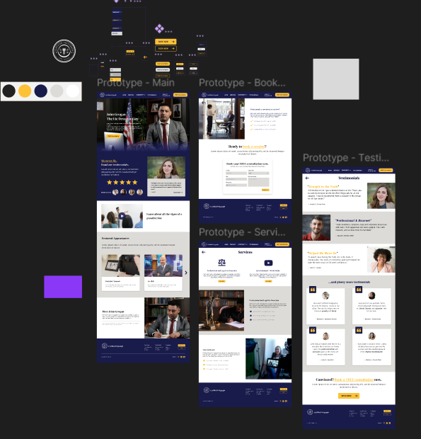
3. FINAL
Preview 3.1 Prototype Preview (Figma).
Link to the Figma file: https://www.figma.com/design/b0yq527DHspGAT0NE3vJu4/Prototype?node-id=0-1&t=M7I1CgGsAUXjgm2h-1
4. LECTURES SUMMARY
Week 7
This week's lecture was about "Box Model Layout" that included learning about:
The display property in CSS controls the layout. Every HTML element has a default display value; commonly block or inline.
- Block and Inline
- Box Model
- Flexbox
-
After the lecture, we went and tried out what we learned in the lecture in our code. We used the methods to change our navigation bar, contact form and also the added cards with content inside them and how to display them in a row.


Feedback:
No feedback on Project.
Week 8
This week was Individual Learning Week so we had no classes but Mr. Shamsul gave us an activity to do for the week. The activity was to inspect a file that he gave us and determine what was wrong with the code (both HTML and CSS) and fix it.
The main problems I found in the HTML file were that:
- Some closing tags weren't present
- Closing tags were misplaced, leading to styles not affecting the needed sections/divs
- No flex display for the row section so all the cards were just sat in one column
- Parts of the cards were not centered
- Navigation menu wasn't applied any proper style to
- Contact Form needed tweaking.
- The footer was also not properly centered and designed.
With these problems I took down, I made fixes to them, mainly referencing the previous week's code.


Feedback:
No feedback on Project.
Week 9
This week, we immediately jumped into class by learning how to create dropdown menus. It was a bit hard to follow with the many dropdown and dropdown-content codes we had to use for each specific states of the dropdown menu. But the end product is satisfying.


Feedback:
- Everything looks nice.
- Keep in mind of document flow.
5. REFLECTION
I had a bit of a smooth start at first because my wireframes were already laid properly so there wasn't much need in changing the placement of things. But in terms of designing, I found myself feeling a bit "bored" in a way because I'm not much of a fan with the formal type of websites. Though this idea did stem from an interest I had, it slowly started turning out to be a bit tedious because of of it is pertaining to law-ish things. However, I still liked the clean outcome of the pages and how that even though I changed things here and there I still managed to make them appear consistent to an extent.
Overall, I think this Project was an informative one abut that I hope I don't go through the same struggles when I design the next two pages' prototypes for my Final Project ಥ‿ಥ
🌊
Comments
Post a Comment