🐋
Week 7 - Week 13
2023.10.31 - 2023.12.22
Qistina Nuralya Maria Binti Azly / 0354180
Typography / Bachelors of Design (Honours) in Creative Media / Taylor's
University
Task 3: Type Design & Communication
Table of contents
1. LECTURES
2. INSTRUCTIONS
3. PROGRESS WORK ON FONT DESIGN
3.1 Research
3.2 Sketch Exploration
3.3 Digital Exploration
3.4 FontLab
3.5 Poster
3.6 Final Outcome
4. FEEDBACK
5. REFLECTION
6. FURTHER READING
1. LECTURES
1.1 Pre-recorded Lectures
All lecture notes have been recorded in
Task 1.
1.2 Face-to-Face Classes
Week 7:
We ended our Task 2 and got a very brief look into Task 3. We were asked to
try sketch out the given letters during Week 8 with three chosen pens
Week 8:
Individual Learning Week so no classes ᕕ( ᐛ )ᕗ
Week 9:
Feedback session on our typeface sketches and the start of our
digitising.
Week 10:
Feedback session on our digitisations.
Week 11:
Feedback session on our digitisations, with a bit of demo of FontLab provided by Sir Vinod.
Week 12:
Feedback session of our fonts within FontLab and also the initial designs of our black and white font poster.
Week 13:
Feedback session of our fonts within FontLab and also the initial designs of our black and white font poster.
Week 14:
Finalising our poster with the feedback we were given.
2. INSTRUCTIONS
File 2.1 Module Information Booklet
3. PROGRESS WORK ON FONT DESIGN
3.1 Research
Before starting to create my designs, I first started bits of research of what I liked most in fonts.
Fig. 3.1.1 "Watermelon" font by izzylikestodoodle
I realized my taste in typefaces were more into the thicker and "less formal" looking ones like in
Fig. 3.1.1, 3.1.2 and 3.1.3.
3.2 Sketch Exploration
We were told to sketch some designs using 'odnhg' and 'ODNHG' as our starting point. I ended up sketching up a lot of designs using about 4 markers. I decided to try out calligraphy and standard broad brush nibs.
Fig. 3.2.1 Initial Sketches using 3 markers/pens.
In the initial sketches, I used three different brushes: Unicorn Calligraphy Pen, Pilot Lettering Pen and Faber-Castell Textliner 38.
Unicorn Calligraphy Pen:
Due to my unfamiliarity with the use of brush nib pens, I tried my best to control my the width of my strokes throughout the sketches.
- Trying out the pen with a generic style.
- Attempted to create uniqueness with some letters being "sliced".
- Bolder style, stencil inspired.
- Took advantage of the flowy nature of the pen and created a wavy/distorted style.
Pilot Lettering Pen:
I liked using this pen because the flow of using it was really nice and just the general boldness of the pen caught my attention.
- Tried out a Bold Serif style.
- Geometric design but I was stumped on H, N and G.
- Slightly sharp geometric design but with low-caps.
- Worked off of the previous sketch and made it less sharp and more condensed.
Faber-Castell Textliner 38:
The flow of this pen was similar to the Pilot pen but with a thicker nib. It was a textliner/highlighter, so it was water-based and because of that, some parts would appear as darker than others due to the overlapping of strokes.
- Attempted to create a style where the right side was thicker and has a distinct slant; then the left side has thinner strokes.
- Tried to create a 3D-ish style with the typeface acting like ribbons.
- A generic style just to test out.
- I didn't really like this sketch because of the weird flow I had with it; but I liked the 'g' :-)
Fig. 3.2.2 Initial Sketches using an Artline permanent marker.
Artline Permanent Marker:
Initially, I sort of avoided using the Artline markers because it bled a lot through the graph paper and stained whatever was behind it (because it was alcohol based). I realised, though, that I could easily just use a plastic behind it to catch whatever bled through. The bleeding aspect was what actually drew me into the marker because the bleeding created more thicker and bold strokes, just as I intended with the research I did beforehand :D
- odhng : this was my first time trying out the pen, did a general style sketch.
- odhng : tried to use the concept of short ascenders and descenders.
- ODHNG: slightly inspired by Japanese calligraphy with the way strokes are placed.
- ODHNG: a cleaner sketch and I like it but felt like it was a bit too clean.
I ended up using the Artline Marker for my final sketches (surprise surprise!). More specifically, I chose to work more on 2. odhng because I liked the concept of a bigger x-height/short ascender and descenders :D But it had a few flaws like the stem of 'd' curved a bit too much and made it look like an 'a', so I had to rework it in the refined sketches.
| |
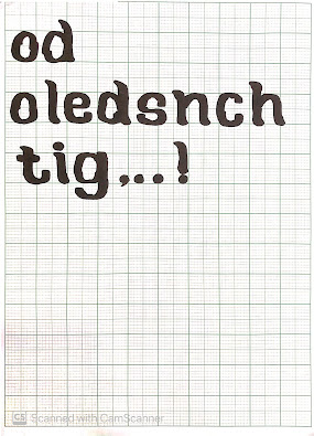
Fig 3.2.3 Trying different strokes and ways in drawing, "oledsnchtig.,!#", with the Artline Marker. |
Here I tried out different ways to create the typeface which included varying the height of the of the stems as well as the width of the bowls of the letters. I struggled quite a bit figuring out how to create the 'i' and '!' (apparent with my frustrated sketches of them haha), but I decided that it was a problem I could solve during the digital exploration section of the process.
3.3 Digital Exploration
Before digitising, I had to choose the Perfect final sketches for a foundation for my typeface. I brought these sketches into Adobe Illustrator to start digitising.
Fig 3.3.1 Selected final sketches.
I identified the main shapes I could use to keep a consistent typeface. 'o' and 'l' shapes were prominent in most of the other letters so made them first using strokes.

Fig 3.3.2 'o' and 'l' illustrated over the sketches in Adobe Illustrator.
Next, I started to create the rest of the letters.
Fig 3.3.3 Preview mode of my letters which showcases a mixed use of shapes and strokes.
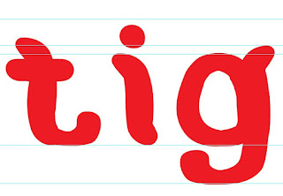
As said before, I had a bit of trouble creating the 'i' so that it would fit with the vibe of the rest of the letters. While digitising though, I found out I could shorten the 'l' stroke and make it to a sensible size for the 'i'. Same went with the punctuation!
Fig 3.3.4 'i' side-by-side with 't' and 'g'.
Fig 3.3.5 Punctuation marks draft using 'l' as a base.
Fig 3.3.6 Initial draft of all the letters and punctuation marks.
Fig 3.3.7 Draft with added imperfections for uniqueness.
After getting feedback, I changed the thickness of some letters to match with the others, as well as the flow of the punctuation mark's strokes because it was a bit too distracting when they flowed the opposite direction of the letters.
Fig 3.3.8 Changing the direction of the exclamation mark and hashtag to have a better flow.
While doing that, I also managed to take a look at the tutorial (made by @grillitype on Instagram) Sir Vinod gave us that we were supposed to watch before creating the punctuation. I totally overlooked it and had to rework my punctuation slightly because I could see the flaws in my initial designs.
| |
|
Fig 3.3.9 Fixing my comma after viewing the tutorial. |
Next, I did a few demos of the letters just to see how they'd look in properly formed words/sentences.
Fig 3.3.10 Demo of my typeface with proper words + added bonus of a few letters in "JAMes Bond".
Fig 3.3.11 Final draft before and after uniting them into individual shapes (preview mode).
Fig 3.3.12 Final measurements.
3.4 FontLab
I brought over my designs into FontLab and started tweak the spacing and letters just to improve the legibility of my typeface.
Fig 3.4.1 Regaining the counter of 'd'.
Fig 3.4.2 Kerning and tracking a full sentence.
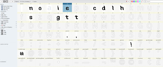
Fig 3.4.3 Full character map.
Fig 3.4.4 Droopdle downloaded.
3.5 Poster
Fig 3.5.1 Poster Designs
3.6 Final Outcome
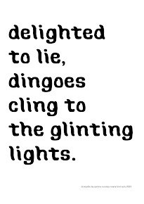
Droopdle - a play on words with Droop and Doodle
Font Download Link: https://drive.google.com/drive/folders/1a63tdW8F0g11MTrGWQ95TDqDD5pwC_lM?usp=sharing
Fig. 3.6.1 Final Font, Droopdle (JPEG) [Week 12, 12/12/2023]
File 3.6.1 Final Font, Droopdle (PDF) [Week 12, 12/12/2023]
Fig. 3.6.2 Screenshot of Metrics Window with two sentences (JPEG) [Week 13, 19/12/2023]
Fig. 3.6.3 Final Font Poster (JPEG) [Week 13, 19/12/2023]
File 3.6.2 Final A4 Font Poster (PDF) [Week 13, 19/12/2023]
Font Preview:
4. FEEDBACK
Week 7
- Feedback for this week related only to finalising our Task 2 -
Week 8
- No Feedback because of Individual Learning Week -
Week 9
General Feedback:
- Label the sketches with which brush was used
- Would be ideal to include the inspiration for the sketches.
- Sketch using black because during digitisation, you can play around
further with the colours there.
Specific Feedback:
- I could label my Artline #3 as sort of stencil-like. Ms Hsin that it was
unique :D
- Unicorn (4) caught Ms. Hsin's eye because of the waviness of the
letters.
- My "melting" typeface was really interesting to Ms. Hsin.
- I should try researching about the 'Blur' typeface by Neville
Brody.
- Try keep the curves more consistent; alternate the curves at the start
and end.
- The 't' should be shorter than the lowercase letters' ascenders.
Week 10
General Feedback:
- Consistency is key for typeface design.
Specific Feedback:
- The counters of the d and g are too different.
- The weight of s and c are slightly too light compared to the rest of the
letters.
- Overall, my typeface looks like liquified-ish.
- The added details gave my typeface more personality :D
- My exclamation mark didn't really follow the flow of the font, so I
changed the direction of the stroke of it.
Week 11
General Feedback:
- The curves of a stroke naturally enters from the left.
- The stem of 'i' should be the the length of the x-height.
- The horizontal line in t should be in line with the x-height.
Specific Feedback:
- Try organising the letters by grouping them with similar
characters.
- Would be better to have the ends of the 'c' farther apart to have a more
open counter form.
- Subtle differences between my typeface revisions were good.
Week 12
General Feedback:
- Remember to name your font for convenience when making the poster.
Specific Feedback:
- Ms Hsin said that it was good I experimented with different words to
analyse any out-of-place spacing.
- The counter of 't' look slightly too big.
- '!' and "#' were a bit too distracting, consider making them lighter
compared to the letters
- I should have the dot of the 'i' go with the flow of the stem.
- Kern the space between 'i' and 'l'.
Week 13
General Feedback:
- Try not to promote another message when creating the poster to promote your typeface.
- Use Univers LT Std (9pts) as per instructions for the name of your typeface and your name in the poster.
Specific Feedback:
- The '#' as the replacement of the 'o' is a nice touch.
- I can finalise my poster! :D
5. REFLECTION
5.1 Experiences
Being able to craft a typeface was really interesting! I've dabbled in creating fonts before but never really into the analysing the font and its measurements. So, it was interesting to be able to precisely sculpt my typeface in a way that gave it personality and still having a good balance of structure and consistency.
5.2 Observations
During my process, I realised that my taste was more onto the less formal looking fonts because of my disdain of formal-related things. Mainly though, I was able to observe and understand the small changes in a typeface that helped to transform and give the typeface its own uniqueness! Understanding negative and positive space was definitely key in making my typeface legible.
5.3 Findings
I found that through making a typeface of my own that:
- Typeface creation requires a balance of technical skill and artistic creativity.
- A LOT of patience.
- Being able to tell a story with the typeface is very much important.
Overall, this task most definitely changed how I view typefaces from now till the future!
6. FURTHER READING
Since I was quite busy during this time, I managed to read only one book which I borrowed from the Taylor's Library.
Fig. 6.1 "New Typography" by Nina Levett
This book was mostly a book to reference or get inspiration from as it compiled many different types of fonts! It also includes small tidbits of analysis of each fonts just to give an idea of the importance of structure in a font even if it's a cartoony one. I definitely would recommend this for students currently in an artblock and are lost in what to do for their creation in typefaces :D
Fig. 6.2 Pages in which I was very inspired by after going through a small artblock. 🐋


Comments
Post a Comment