Table of contents
1. TASK LINKS
2. SUBMISSION
3. REFLECTION
1. TASK LINKS
1.1 Task 1: Type Expression and Text Formatting
1.2 Task 2: Typographic Exploration and Communication
1.3 Task 3: Type Design and Communication
2. FINAL SUBMISSIONS
Fig. 2.1 My final four static type expressions (JPEG) [Week 4 16/10/2023]
Fonts: Futura Std Heavy (headline), Futura Std Light Oblique (byline)
Type Sizes: 33pt (headline), 13pt (byline)
Leading: 34pt (headline), 16pt (byline)
Paragraph spacing: -
BODY
Font: Janson Text LT Std 55 Roman
Type Sizes: 9.5pt (body text), 10pt (caption)
Leading: 12pt
Paragraph spacing: 3mm (body text)
Characters per-line: 40
Alignment: Left
Margins: 12.7mm top, 12.7mm left, 12.7mm right, 12.7mm bottom
Columns: 3
Gutter: 5 mm
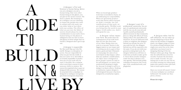
Fig. 2.3 Final Layout - No Guidelines (JPEG) [Week 5 24/10/2023]
Fig. 2.4 Final Layout - With Guidelines (JPEG) [Week 5 24/10/2023]
Fonts: ITC New Baskerville Std Roman (Letters); Univers LT Std 49 Light Ultra Condensed (Numbers and '&')
Type Sizes: 108pt (Letters); 100pt (Numbers and '&')
Leading: -
Paragraph spacing: -
BODY
Font: ITC New Baskerville Std Roman (Body Text), Italic ("Correct it...Get another one.."), Bold ("Please do it right."); Futura Std Medium ("A designer..")
Type Sizes: 10pt, 9.5pt ("A designer..")
Leading: 12pt
Paragraph spacing: 8mm (First line Left Indent), 4.2mm (Space After)
Characters per-line: 38
Alignment: Left
Margins: 12.7mm top, 12.7mm left, 12.7mm right, 12.7mm bottom
Columns: 6
Gutter: 5 mm
Droopdle - a play on words with Droop and Doodle
Font Download Link:
https://drive.google.com/drive/folders/1a63tdW8F0g11MTrGWQ95TDqDD5pwC_lM?usp=sharing
3. REFLECTION
3.1 Experiences
Typography as a whole was an interesting subject to learn. It becoming something I usually look past on to something I can casually analyse outside of the classroom was really eye-opening! Being able to critique my own understanding of Typography was a challenge as I sometimes looked at my work with rose-coloured lens; but with a bit of self awareness, I managed through it :P
3.2 Observations
During the 14 weeks, I became aware of the significant influence type has in the design world. Typography is more than just aesthetics; every font selection and layout decision communicates its own story with emotions and feelings! Being able to analyse the past and present state of typography brought to me a new lens into how much the world affects its art (including typography!).
Understanding the relationship between structure and creative freedom in typography is key to any artists' success. Having my friends to be there and also critique my work while I do the same to theirs was a good way in improving my communication skills :D Ms. Hsin was also a great amount of help with the feedbacks she gave.
3.3 Findings
This module demonstrated how design principles and effective communication work together, shedding light to the need of intentional typographic choices that are appropriate for the intended message, target audience, and situation. My understanding of typographic hierarchy, layout, and design gave me the ability to create compositions that are both aesthetically pleasing as well as satisfactory in my eyes :) It also emphasized the adaptability of typography while highlighting the significance of communication.
In the end, my typographic journey started off rocky, but once I'd grab hold onto the things I found interesting within the module, I quickly gained my stead and marched forth till the end!


.jpg)
.jpg)


Comments
Post a Comment